

 |
Initial Ideas |


|
| Initial Ideas |


We completed our final designs and our context to go with it and show it applied to the bus interior. As a group we a pleased with our results and I am happy that we have our 10 final design conclusions.
 |
| Classic Stagecoach designs |
 |
| Gold Stagecoach Designs |
 |
| Eco Stagecoach Designs |
As we have had difficulties and problems with sampling for bus seating, I wanted to at least have something tactile to show. I really enjoy sublimation printing so, I laid down some disperse dyes on to brown paper in the Stagecoach colour scheme. After they had dried I cut them up and began to collage, creating non repeating designs, almost using this as a drawing tool. I used my photographs and previous drawings o the market to guide me with he shapes and lines. I used masking tape on the back to construct the collaged pieces, as well as pritt stick (which didn't work so well). I really tried to ensure that all the shapes fit together like the drawings and initial designs I have already created. I ensured there was not white space by overlapping them slightly at the back and taping them in place.
I heat pressed the paper designs onto cotton polyester, as the colours still come out vividly but the material has a better quality than polyester. The samples were very small, and much like mini drawings on fabric- which I quite like. These samples were no way trying to be final repeat designs for a bus seat as this was just not doable. I will attach these little samples into my book to show development of my drawings. Where I had used the pritt stick on some pieces, it has left markings on the fabric which has taught me not to use it again!!! oops!!!
I could maybe do this same process but on a larger scale, the only problem would be having to repeat them? I have used some of the small samples as inspiration for my final design conclusions. I wish we had some more time to create more designs and sampling but we simply do not.
 |
| Collaged designs on brown paper |
 |
| Small samples on cotton polyester. The markings around the shapes on some samples are from the pritt stick! I need to be more careful when choosing my materials that I work with. |
 |
| Bigger samples, the middle was constructed free hand under the heat press, I did not prep this before hand and this made me realise I must stick them together in a considered manner so that there were less white gaps. |
I'm currently finding it really difficult working in a group, it seems as if everything is taking so much longer than it should do and ideas and deadlines are not being met even though they have been agreed on. As we are large group, finding time for everybody to meet at the same for a decent amount of time is proving difficult. We have to have our design conclusions for every bus completed (with context) by Friday for our group presentation and it is hard to just communicate via WhatsApp. There have been some members in our group who have met the deadlines and communicated really well even if there were issues with meeting, which has been a positive aspect and proves that it can be done!
The sub group who are working on the Eco Bus have struggled to keep to the time constraints and the deadlines we set to ensure we could refine/develop the designs if needed. Over the whole project we haven't seen much of the Eco groups work as the theme of their drawing kept on changing and suggestions made the other group members weren't always taken into consideration. It would have been ideal if we meet up more often and review everybody's work as time went on; but members forgot their work continuously and we struggled to meet up frequently.
There hasn't been a clear leader of the group and this may be the problem. I have tried to give people roles when creating the presentation (so that the work load is spread over everyone) without taking over too much as I am not naturally a leader. I am just concerned that I will end up doing all of it when we are rushing to get it done on Thursday night!!! All I can do is get on with for my subgroup and complete the tasks I have been set and make it clear to other members that the work must be done swiftly.
Chloe and I have completed the 4 designs for the Classic bus and have worked on the context together using photoshop. This has been doable as we live together and can sit together and discuss what works well and what doesn't. There should be three of the group members working on the Classic bus but Chloe and I seem to be the only ones doing so which has been slightly difficult as we didn't want to leave members out but time is running out!!!
 |
| Stagecoach Classic Bus Finals Designs and Context |
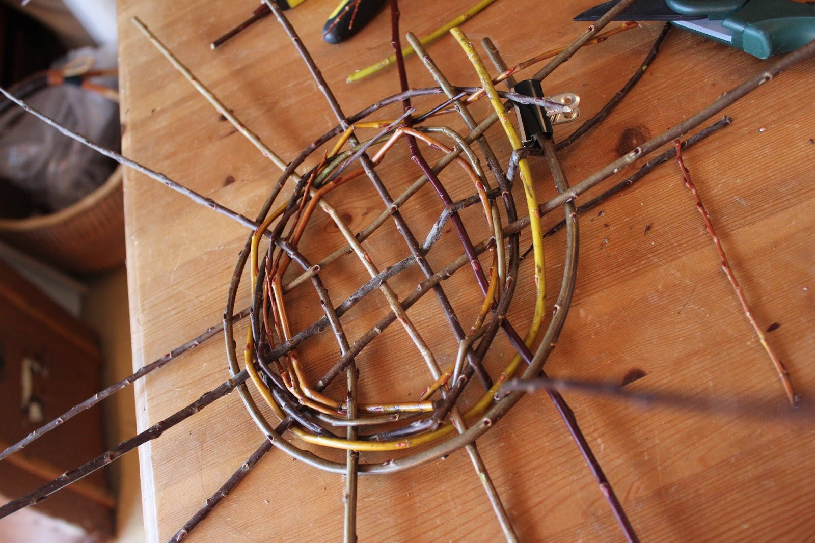
Aviva Leigh runs workshops for mainly weaving and dyeing. She has a 3D weaving workshop scheduled in a couple of weeks time and invited me along to her home studio to help her sample and experiment! She wanted to experiment with willow and wire using a circle loom and basket weaving techniques to then create a 3D woven piece. I have never used a circle loom before and I was really glad I tried it out. It was a long process but worked well, instead of a rigid heddle or a table loom, you had to manually weave the weft in and out of the warp. As we were using wire in the warp, it was much trickier than just simply cotton or wool, as it was stiff and hard to get the weft underneath. In the weft we used recycled materials such as found string and cord from the beach which had a lovely worn quality to it.
We sat looking out onto the river drinking tea and chatting whilst weaving away, which was wonderful, she has so much knowledge and it really inspires me. The day went so fast and we didn't get all of the weaving done but I have bought the circle loom home to continue to play this week.
I would love to continue to use techniques similar to this in the future, I especially love the idea of using found materials from the beach and using basket weaving techniques.




Camira fabrics supply the fabrics for transport interiors such as Stagecoach UK. I ordered some samples to see moquette up close and personal to see if there was any way to replicate this kind of material in our sampling. As a group we also wanted to have a look at the pattern on the moquette.
Although some do look very garish and vibrant, the designs have been chosen and designed for the purpose of being on transport seating and must have reasoning behind the design. Some designs have small repeats which are easily replaced if they are damaged but we have noticed the pattern is lost as the repeat is so small. Looking at the designs on previous moquette seating had given us an insight to the market already and how we want our designs to look. We have been very focused on material, practicality and durability that we haven't thought too much about the design yet.
Seating material ranges:
Aura – Traditional wool moquette in contemporary style
Classic – Soft touch genuine leather
Dimension – Polyester flat weave fabric available to order only
Elements – Contemporary high wool content moquette
Folio – Textured and metallic effect vinyl
Fusion – The latest high wool content lightweight moquette
Quantum – Lightweight polyester moquette with textured yarn options
Vigor – Backed wool rich moquette
Vision – Contemporary lightly textured flat weave offering metallic highlights and contrasting fibre types, supplied with a backing
Vita – Leather look vinyl
The video below shows exactly what Camira does and explains the material choices in the underground seating.
To continue working as a group we decided to create group drawings. We split up into our sub groups (bus types) as this would keep the colour schemes distinguished. Louise, Chloe and I used a variety of mediums on A2 paper, drawing from the Norwich Market, using the lines, marks and colours to create drawings which we could further develop into designs. We swivelled round the paper every 5 minutes to create a better composition. We overlapped drawings, continued the lines and markings from each others, connecting them so they flowed.
Other members of the group used collage to create group drawings which I feel isn't as strong as it doesn't show complete collaboration.
 |
| A2 group drawing |
Our meeting with Kit Miles was an eye opener. He advised us to not repeat their previous designs, creating something new and exciting. We need to investigate Stagecoach as a brand and refer back to their mission statement and aims. We learnt that commercial and residential fabrics have different regulations and rub tests.
As a group we sat down and discussed the pros and cons of moquette and leather. We aim to research further into materials for example the history into using faux leather in bus interior and the psychology behind defacing the seats.
Kit made us think about the impact and experience for consumers. We agreed to research into subliminal messages and interactive and tactile touch points in the bus interior.
 |
| Moquette VS e-Leather |
Stagecoach UK
Its restricted> is this positive or negative?
Sarah advised us to interpret this narrow brief creatively and appreciate how we have many restrictions meaning we wouldn't go off on a tangent. We must fulfil the brief!!!
Brand
-Identify the company
-Identify the consumer
-How do we design for a client/brand/market
-How do we respond to other brands- vital!
Research
-Materials
-Sustainability
-Previous products
-Colours
-Logos
-Target Market
-Subject Matter
-Competitors
-Primary research- bus/interviews
-Stagecoach as a company
-Aims and Mission
Stagecoach
-Wastage
-Pattern
-Colour
-Durable
-Stain resistant
Consumer
market is broad- only with age! Build a consumer profile.
Age
Income
Parent?
What do they care about
Career/job/retired
Ease/time constraint
Social Background
Cultural Background
Tube vs Bus demographics
Access (disabled/elderly/child)
Where they shop
What they do
Where they eat out
What they eat
What they wear
Where they shop for clothes
Hair style
Hobbies
Holidays
Pay for extra life luxuries (Sky tv/ wifi etc)
Pets
What do we want our designs to be?
Contemporary
Inviting
Clean
Calming
Spacious
Easy to use and practical
Simple
Interesting/ conversation starter
We have lots do be getting on with as our session with Sarah has been extremely though provoking. It has made me realise that our group brief could be really interesting, especially if we consider our consumer and explore Stagecoach Uk as a brand.

Stagecoach UK
"Design a collection of fabrics for use in updated buses used for public transport in Norwich. "
As soon as we received our brief we sat as a group and mind mapped ideas and research that we thought was vital to do to understand Stagecoach as a brand and understand the market. We realised that there were many things to consider when it comes to our brief. We knew our designs had to be practical when it comes to material as well as the actual design (repeat and colour choice)
 |
Today I met Aviva and we traveled to her Happisburgh studio to prepare for the Makers Month Event in Feb! We sat and planned last min things such as the children's activities on the Tuesday and Thursday and chatted about my denim patch works. I up cycled 2 tables, a chair and a 2 metre stand/rail (which we are using to hand the giant patchwork at the end). I sanded and painted them using chalk paint, this gave so many ideas of my own, for the future. We plan to have all of this lovely up cycled furniture in the forum atrium for people to get in the spirit of slow, mindful, conscious making. In the blue table we plan to make markings on the edges of the table to replicate stitches and sashioko like in my denim patchwork- I think this would look really quirky add an extra handcrafted touch to it.
In the evening time I deconstructed a second hand lampshade which was part of a large floor lamp. I was left with the wire frame where I weaved, tied and loopeed the shredded fabric which I made in to yarn beforehand, in an out of the wire. I only used old pieces of fabrics, continuing the up cycling, reclaiming, reusing theme. The end result was brilliant and i think the collection of furniture will tie the whole workshop together.
The next time I will see Aviva is the day of the forum event but we plan to have phone calls between then, confirming any last minute details that might crop up.
Aviva shared so much wisdom with me and I feel like I have learnt an incredible amount with Aviva, I feel privileged to have had my placement with her.

I realised how many experimental samples I have got, especially for my Interiors project where I have been using sublimation printing. I must get a move on with some designs and choose my final ones so I can continue on with my other projects.
I tried to devore onto denim not thinking about the fibre content. It obviously ate away at the cotton and I was left with a distressed frayed effect, I thought of this as a disaster at first but realised I could use this in my boro sampling. I looked at boro examples again and discovered that the denim was shredded and distressed!!! This fits perfectly!
I then tried devore onto a cotton polyester but this also ate away most of the cotton and I was left with very little again. I plan to do this more to add to a Boro sample- then repeat this as a final.
I also devored onto my favourite sublimation repeat design (which i was going to use as a final sample) and was crossing my fingers that it would go well but I stupidly put it in the heat press for too long!! It unfortunately went black and I had to wash it various times. It still isn't how I planned but I guess mistakes happen. I do like how the fabric has changed quality, it is much thinner as the cellulose fibres have been eaten away and the synthetic fibres have been left.


Trend Reports
- As discussed, you need to create your own trend. Give your trend a name. When do you predict that your trend going to happen, and where?
- Your trend must be believable. Think about how to use images, references to other designers/trends/streetstyle/celebrity etc to convince your reader that this trend is really going to happen.
- Remember to research your trend in a wider context, referencing designers, artists, other trends etc.
- Spend time reading professional trend reports, and present your own report in a similar way, using labelled images, mood boards etc. Your report may be longer than some of the brief summaries we see online, because yours will include detailed description of your trend and how it relates to different areas of design, as well as an explanation of why the trend will resonate with the audience at this time (eg in response to a current social issue or topic).
My Ideas
eco fashion - link this with future events or news?? > recession?
deconstructs /reconstruct
mending- visible on purpose.. this could link with my fashion project?
make do and mend > too obvious? look at fashion point of view
urban denim- street style
vintage up cycling > "trendy to be thrifty"
eco friendly and sustainable
http://www.elle.com/fashion/g8913/best-eco-friendly-fashion-brands/


"Thrifty is fashionable once more and making your own curtains and soft furnishings is the craftiest way to save money."- http://www.yorkshirepost.co.uk/news/make-do-and-mend-has-become-the-new-trend-1-4325180#ixzz3voprmuaF
"The recession has given rise to the rebirth of a “make do and mend” culture, while television programmes such as Kirstie Allsopp’s Handmade Britain have spawned a surge in the number of people taking up sewing." - http://www.yorkshirepost.co.uk/news/make-do-and-mend-has-become-the-new-trend-1-4325180#ixzz3voq4DDzm
"The recession has had a big impact. People are looking at ways of saving money and learning how to do key skills themselves. You can save quite a bit of money by making your own clothes and curtains and you can make things to suit your own taste.” -http://www.yorkshirepost.co.uk/news/make-do-and-mend-has-become-the-new-trend-1-4325180#ixzz3voqkw69N
“Making your own clothes is not cheaper now there are shops like Primark, but it is about self expression and turning away from the high street to a more local economy.”- http://www.yorkshirepost.co.uk/news/make-do-and-mend-has-become-the-new-trend-1-4325180#ixzz3votDLWqh
Make do and mend was because of the recession In world war 2... will there be a recession 2016/17?? >>> http://www.cityam.com/215831/when-will-there-be-another-recession-uk-it-could-be-sooner-you-think
"A global recession is usually defined by economists as an extended period of below-capacity growth. City puts global potential growth at 3%, but expects growth to “reach or fall below 2%” before bottoming out in 2017." - http://www.theguardian.com/business/2015/sep/09/global-recession-two-years-likely-economist-buiter
"We may be on the verge of another global recession. Patterns in economic data are showing signs of weakness, and the troubles persisting in Europe or the bubble bursting in China may be the trigger that sends the economy over the edge" http://www.investopedia.com/articles/investing/071515/6-factors-point-global-recession-2016.asp
Trend Report Research
Trend forecasting help
Geraldine Wharry from WGSN tumblr
Nick mentioned to me about a relation between mine and Shirley Craven's work. I could see connections between her delicate drawings and mine and then her geometric prints and design and mine. Shirley studied at the Royal College of Art.

After researching Albers and Colour theory, I noticed a direct link between the colours and shapes in my work and in bauhaus inspired textiles or drawings. It has inspired me to continue to use and use only primary bright colours (initially taken from SADACC).
The Bauhaus movement began in 1919 when there was an idea of bridging the gap between art and industry by incorporating crafts and arts. Walter Gropius stated that all crafts, including art, architecture and geometric design, should be combined and mass-produced. Gropius argued that architecture and design should reflect the new chapter in history, post World War I.

Visiting the Castle Museum today for the first time this academic year was uplifting. Seeing our work being exhibited was lovely and looking at the other years' sketchbooks was actually so helpful. I wish we has a chance to see first years' sketchbooks more often as it was refreshing to see.
Our repeat lengths were hung nicely around the museum and it was nice to see members of the public admiring them.
I also used my time to look at the natural history and wildlife area to draw from the shells there and take some photographs to refresh my drawings and give me ideas.
 |
| Repeat length and ribbon (from year1) |
 |
| Fashion for Passion event |
 |
| Shell and project 2 visual research |
Reassurance is what I needed to help me keep pushing my ideas forward. I know I need to get my final designs done ASAP as the fashion project needs to be started soon. I told Jill I was worried about my time management and how to put my designs in to repeat as I wanted to stay away from digital printing.
For placement overview:
-Small info about Aviva and the rest critical analysis
For the interior project:
-wallpaper- look at claire coles and look at Charlotte Abraham
-think about context?- cafe/corporate space/home/audience- adolescent/children etc
-To help me with repeat... Photocopy motifs onto acetate then flip/adjust/layer up/half drop etc
-create a complex repeat by adding depth and level- add background using subtle marks from drawings etc
-make the samples a collection so they flow together
For the Fashion project:
-Begin drawings for this project- continue with shells but explore in depth
-Indigo dyeing- could experiment with discharge and resists
-Try to give myself a title for my fashion collection- like the lecturer today who worked at USP- Jane Kellock
-Look into mending/patching
-Go to study centre- mending/darning etc
-Boro Boro book by Nuno Collection
-Try sashiko stitching with fine threads or metallic threads and explore different stitches
 |
| Left top is a sample with no devore Right top and bottom has devore on some parts (brighter and more vivid) |
I initially wanted to have my collection of designs for a living area featuring cushions, a quilt and an upholstered chair but my practical work right now isn't relating well. I feel like I should carry on with the path that my work is going down naturally as I don't want to force my work to go a certain way. I am doing CAD embroidery on Monday the 30th and I will reflect once I have gained some more digitally stitched samples as I have never done this before- I might love it or hate it!
 |
| Habitat Ideas for cushions? I love the design in the lower centre!- stitched grids- geometric but includes interesting marks which could relate to shells etc? |
 |
| Anthropology throws- very textured? Could I create something like this without having to weave???? |
An African American majority community and census-designated place in a large bend of the Alabama River in Wilcox County, Alabama.

After creating some lovely pieces when sublimatiion printing I realised how geometric my prints were becoming and I began to worry that I was going off on a tangent. My initial drawings were very loose and based on shells and beach debris. My prints have become very linear, I am hoping that combining my processes such as stitching and dyeing will help change this.
 |
| Fibonacci Golden Spiral |
There are three basic categories of colour theory that are valid and useful: The colour wheel, colour harmony, and the context of how colours are used. Colour theories create a logical structure for colour. For example, you can organise a collection of colours then place them in a circle that shows the colours in relation to each other.
Albers was one of the first modern artists to explore the psychological effects of colour and to question the nature of perception. I find his work influential as he looks at colour in depth, his paintings/studies are beautiful just as they are and I appreciate the meanings and theories behind them.
