Our group decided to trial out our print using our colours. We created a mini kodatrace collection for the 4 different colours. We found out different problems that occurred and were glad that we tested it out before the final 3 metre print on the 20th. We found that the colours work quite well, although they do not overlay to make a new colour (like yellow and blue would overlay and make a green) but not much overlaps anyway. They do not make muddy colours anyhow. We discovered that the flowers had a lot of fine detail which meant that the detail was lost when the dye was applied, the dye also bled a lot. This could have been down to the amount of pulls we did with the squeegee but we have adjusted our print design just in case. We changed the amount of lines we have in the flowers as the lines just merged into one 'splodge' of colour and the yellow block colour underneath was not visible. The line detail will be finer and more considered.
After an acid dye technical refresher with Yasmin in the print room our group had a space on the print table. This was to test out the colours we had agreed on and give ourself a chance and time to change or tweak the colours just in case they did not compliment or overlap pleasantly.
Our group on agreed on a light grey as mainly a background colour, a light yellow, a pop of orange and a dark blue/navy to act as an outline colour. All of these colours compliment each other nicely but we were unsure how they would look together, overlapped and in a design. Today we tested different tones and mixed multiple dyes up so get it just right. We are creating a mini screen using a portion of our design to put on 4 kodatraces to test what it will really look like. This is incase there are any unexpected issues or problems. We have booked the print room for Tuesday the 6th.
For colour inspiration for my group's colour way and my own, I have been using pinterest (below)
Follow Amelia's board COLOUR SCHEME on Pinterest.
In our group, we are drawing individually so we can combine our drawings together, we will temporarily stick drawings down so we can create a mock design and change compositions. As a group, we have decided that we will draw from objects that have interested us over the last few days that link to a loose theme of nature.
- Lauren: jewellery, flowers,
- Amber: bees, honeycomb/nests and leaf printing
- Me: dreamcatcher feathers, shells
- Shiv: cactus texture, shells
We think the contrast between Lauren's geometric flowers and my marks from feathers and shells will look considered and interesting.
Using a combination of drawing strategies is really helping me create different marks. Drawing isn't my strongest skill but I find that working large and loose helps me with considering shape, line and texture. Observational drawing has worked extremely well for me as I feel the pen does the work for me whilst I look at the object in detail (I need to use this technic throughout the year!).
TO DO:
Scan/photocopy/enlarge real honeycomb/bees nest and transfer that to tracing paper or kodatrace
Create a mini mock up of repeat design tomorrow (combining everyone's drawings)
Look into colour palettes as a group
We were reminded as a group on how we can creatively apply line and shape to kodatrace in a quick 1 hour session. This helped me and reminded me how it doesn't just have to be black fine liner or chinagraph pencils.
- Photo opaque (variety of brushes and mark making tools)
- Black paper
- Posca pens
- Oil pastel (rubbings/resists)
- Graphite (rubbings)
- Stitch with black thread
- Lace/fabrics
- Chinagraph
- Acrylic paint
- Hole punched paper
We began this workshop with drawing activities using our personal objects to draw from on A1 paper, using many drawing strategies:
Negative space
Texture
Line/shape
Tone/shadow
Blind drawing
Continuous line timed drawing
Using a variety of drawing strategies is really helping me find a style and forcing me to use different scales and unique techniques. I enjoy timed drawings to then subsequently add and work into them to create more considered, delicate marks. I want to build a sketch book using these techniques, layering different drawing techniques with tracing paper, acetate and contrasting textures.
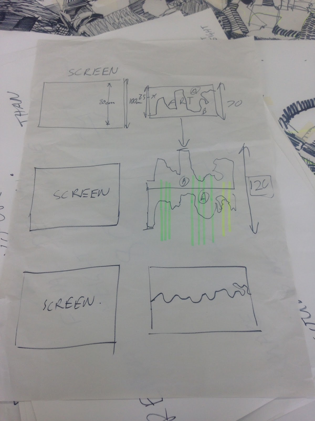
Today we combined the groups drawings we did individually with bold black pen using different strategies to create a large A1 collage of line and shapes etc, filling in spaces with and marks from our objects to ensure it flowed. We then cut through the A1 collage in a wave. Ensuring the wave was not too dramatic or high to create the subtlest repeat as possible.
Make a Repeat Pattern in 60 SecondsMake a Repeat Pattern in 60 Seconds with Julia RothmanFull Class → http://skl.sh/repeat-patterns
Posted by Skillshare on Friday, 16 October 2015
Today I started 2nd year Textiles and began drawing straight away. We were briefed on Ba2a and then started a drawing shop that informed us on repeat printing.
Using different drawing strategies like continuous line and timed drawing we observationally made drawings from decorative and vintage objects.
We had rules put in place:
-Black thick pen
-A1 paper
-Hold the pen with like a paint brush (loosely)
-Stand up and don't bend over the table when drawing
-Continuous line
Having had a very busy summer I feel as if I have neglected drawing. I have spent my day researching ideas and themes for BA4 as well as looking at the last years BA4 brief to give me an insight. I have a collection of shells from my summer breaks so I chose to use these to observationally draw from them as I know this is the best way. Using simply chinagraph wax pencils and 0.1mm fine liner I have studied the textures as well as the lines and marks of various shells.
I also used photographs from London Zoo to "warm me up" and begin my drawings.
Visiting New York City in May was a trip mainly organised so that textile design students at NUA could visit Surtex. Surtex was a show full of (mainly) textile prints . I liked how the prints were shown in context on some of the stands. We had the opportunity to talk to the exhibitors which enlightened us with the work involved and expected of us. The show was huge, I noticed I started looking at the stands that really stood out and caught my eye after a while. I became aware of the similarity between many stands which proved to me that my work must be unique to stand out and gain attention.
We also visited the National Stationery Show and The Furniture Fair which were in the same building. I personally enjoyed browsing the stationery show the most as there was a larger variety of prints, illustrations and patterns. Visiting The National Stationery Show enlightened me and introduced me into the broad range of different styles and opportunities in the stationery industry. I was inspired by the fonts an graphics used and this has encouraged me to practice my photoshop skills. This will enable me to create photoshop designs from my drawings, which I have previously done in my first year of Textile Design at NUA.