
Today I hand in my work, after a stressful, tiring week I am pleased to get it handed in and I am pleased with the work I have completed. Although I have run out of time to finish some aspects off, I feel that this isn't particularly a negative, I think that this is good thing as I will be able to continue these things on. I want to be able to use print further, not just creating final designs digitally, I aim to print on a large scale using procion, pigment and sublimation. I want to continue to use a combination of processes, digital, traditional and unconventional. I want to continue my ideas from the CraftCo project, using cork and wood further and I am hoping that this week coming will enable me to push this further with no other distractions.
In terms of my research report, I want to continue to refer to the information I have learnt from the research from this to be able to apply my work to various contexts, considering the demographic and client.
The craftCO meeting this morning was helpful, dispite only being a small meeting, it has made me realise, after actually discussing it aloud, that my cork coasters that I have laser cut are more suitable and I really must change my plans for those. The cork has burnt, it smells and the black markings are rubbing off. I could try to solve this problem by cleaning it up or hand cutting which won't necessarily remove the smell and all might be so time consuming, meaning not worth the money in the long run (if these are going to be sold). I am thinking that wood would be a better material to work with further as this also invites more questions on how it has been printed on (sublimation printing) I will continue to create, design and make next week after the assessment work has been handed in.


I continued designing fashion conclusions this afternoon, using AVA to play around with repeat structures as I was initially thinking of doing two in repeat and 4 as placement prints. In my group crit, Nick suggested to have them all as a repeatable print which enables manufactures repeat the print if necessary. I also got a positive response from my illustrations and context experimentation which means I will now spend more time on these to perfect them.
I was unsure how to display my designs, in terms of repeat and scale, as well as how I would portray my ideas further of negative space in the garments. I played around quickly with the space where I applied my design, changing the scale etc as a test. I prefer the scale larger but with other areas of the garment with a different scale of the same print on it too.
I was unsure how to display my designs, in terms of repeat and scale, as well as how I would portray my ideas further of negative space in the garments. I played around quickly with the space where I applied my design, changing the scale etc as a test. I prefer the scale larger but with other areas of the garment with a different scale of the same print on it too.
For the rest of the week I am going to finish off my interior designs and create the mood boards for both projects to display them in context.




I have taken on board Nicks advice of changing my colours for the Interior project. I have gone back to the research stage (briefly) to gain inspiration on neutral tones on the street, I photographed the colours and have started building a stronger colour palette. Although this has changed very much from the initial research I carried out on WGSN etc, I can tell this project has evolved already just by changing the colours. I have done some more drawings in a more considered colour palette and using the methods that were successful previous (like gently tearing the printed papers and cutting sharp edges creating contrast and texture)
I have thought further about the client, connecting to my Research Report. I tried to understand the need of the customers at St Christopher's Inn, considering the demographic etc. This will help me in creating the most suitable design for the hostel, further considering the materials.




Trying to understand the scale of my interior designs, I created fairly quick draft designs on photoshop, and then printed them out in different sizes. I used a small scale model to try and gauge the scale that I wanted my designs to be when in context.


I am unsure whether to pursue these designs as a repeat or a placement print... I could do both? Is this a professional way of creating a collection of prints though?
I am unsure about the background colours of my designs, I have experimented with changing the colours after seperating them in AVA which has helped me answer my questions. I think I am going to have a variety of dark and light backgrounds with dark and light shapes on top.
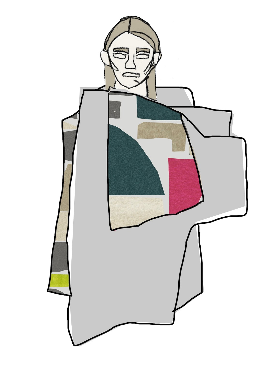
I am starting to think further about how the design will fit onto the body. I still like the idea of having splices of skin showing in the shape of the components in my designs as this links with the idea of negative space. I am unsure whether to have panels of my design on the garment rather than covering the whole of the body.
I have been using photoshop to quickly see the design on the body by just creating a negative stencil, so that the design comes through from underneath- this helps me consider scale and how the design works as a garment. I need to thin further about the context and whether it will go and who would where it... what is my audience or "muse" who would wear it? I have also been hand drawing outfits, using a layout pad and a body template to help create shapes that fit on to the body. Using my negative space drawings has helped me connect the shapes together to build up a garment to then apply my drawings into.


Today, I masked off areas of the large scale prints using masking tape and newsprint. This would mean that the background of the drawings would then gain colour, complimenting the bold design on top. I aimed to skew the screen slightly, so that the print was off centre and didn't line up so that this made an interesting design.
I found that this was fairly difficult due to the large screens I had to use, it initially went wrong after using a squeegee that was not washed properly, meaning I had a pink line down my drawing. I tried again on another drawing, this still didn't go to plan as I found that the paper was to thin meaning that the water content made the paper curl and crease.
I used thicker paper and also use pigment, this seemed to work more successfully but I still found that this didn't work as I hoped.


Today I played with cad embroidery onto my fashion samples that have been sublimated with collaged papers (also using cut out resists). I layered some pieces of laser cut fabrics and knit on top of the printed fabrics and secured with vilene. I created some CAD designs using scans and drawings on photoshop but also found it useful to hand draw the design straight onto the Generations software. I found that this created cleaner lines and also shortened the clean up time of the design.
I designed fairly simply shapes, just keeping the outline so that the the shape wasn't filled as I didn't want block colour or block stitch on my print as I thought this would take away the simplicity.
I still feel that the CAD was unsuccessful in some ways, this may have been down to the choice of stick length and density but also the colour choice and positioning of the stitching. If I could do it again, I would use neutral colour thread and loosen the stitches by changing the density even more as well as working on less white fabrics (changing the ratio of colours).
 |
| layering the laser cut fabrics, that were sublimated |
 |
| before the fabrics were stitched into |
I also want to further refine the colours in my fashion projects, well aware that the design process should be starting very soon. I need to ensure that I include more neutrals in this project too. So that the colours that are present are pops of colour.
My tutorial with nick about all projects has made me realise that I am over complicating things and necessarily matter. I also have realised that the things that have taken the longest are not necessarily the most successful.
Also I need to change the colours with my interior designs, I knew they weren't working but couldn't understand why, nick suggested to change the colours to more neutrals and also play about with the idea of shadow (floor and wall context idea). He also made it clear to me that the idea of the magnetic wall panels was unnecessary, and did not fit with the the context. The panels would have had to be on such a large scale which would not have worked. I showed Nick the magnetic board with the panels or formica printed panels. Although time and money was spent on this, I feel as if this wasn't wasted. This has helped me understand the structure of the wooden panels.


I am pleased with how Nick responded to my fashion project and he is liking the colours of these and the designs. This is what made em realise that you don't have to sample to be so literal with ideas, not every idea has to be tried out but can just be suggested not necessarily demonstrated- abit like the magnetic formica for my Interior Project.
I have the CAD booked for tomorrow, so I now need to reflect on the ideas and thoughts from this tutorial and build on them, developing my designs and samples. I need to take time designing and planning the CAD because of the length of time it takes to complete in order to make the most of my time. I am going to use cad to stitch outlines of shapes from my drawings to attach other shapes which are the bi product of my laser cutting session yesterday.
Using my laser cut fabrics, I created resists. I felt that this worked fairly well but maybe I should have planned and thought out the designs on the laser cutter beforehand. I would love to continue this further but on a larger scale and with a more refined colour palette. Printing the colours off on the sublimation printed means that this costs a lot of money each time, so maybe I could begin to mix up the disperse dyes and use these instead. This would mean less accurate colours and potentially lest textured ones.


Today I have been experimenting with A1 scale using cut outs and negative spaces from photographs of my found, organised objects. I struggled initially with the size difference and found it hard to use colour in this size- especially when most of the A1 papers were white- I had some pre coloured ones but now I am not to sure on the overly textured coloured big size papers. I tried to work with the white papers and I thought it worked quite well, the colours really popped against the pale background and the shapes looked cleaner and more refined than my previous drawings. Nick mentioned to work back into these drawings with screen printing, blocking and masking out the areas I had already applied college and colour, then slightly skewing the screen to create white areas and coloured areas around the design.


After spending the afternoon drawing large, we had an AVA session where I aimed to learn further colour separation techniques. I found this so helpful as my drawings are fairly easy to tonally separate and is useful to do this to see the drawings/designs in different ways.
I also prepared for laser cutting on illustrator, creating shapes to be cut out to create cut out negative space pieces. I used the shapes from my drawings and prints to then duplicate the shapes in the print. I also prepared for CAD which I have booked for Friday.