BA3b

Crits and competitions

March 06, 2017

This morning I realised that I need to create mini briefs for my self in order to work appropriately and ensure I am making the most of my time. I need to be able to create collections to apply my work to various contexts. From realising this in the crit from a comment from Les, I decided to plan the projects and how long I will take to complete them. I am frustrated that I may not be able to explore materials more (like I had planned) but I feel that focusing on print design and creating a noticeable aesthetic will be more appropriate and worthy for my future skill set and career.

I aim to research further into a variety of contexts that are edgy and appropriate to my style of work. I plan to incorporate the competitions that I aim to apply for/complete within my projects so I have more structure.
I need to further research the different contexts and how I can alter and adjust my designs and colours   to suit the applications:
-wall covering/wall paper... could I link this with the Idott competition?
-soft furnishing> bedding/homewares
-3d wall covering> wood/cardboard/3d
-fashion> urban/streetwear/activewear

After todays crit I have also realised that I must create a criteria of success in order to decide and understand whether a certain piece is working- I MUST REFER BACK TO THIS WHEN I AM STRUGGLING.

Today I considered my entries further for the Bradford competition and how I could use my work to fulfil the briefs. I want to be able to use my unique wood idea for the multi media construction entry but I am unsure where to go with that an dhow to develop if further from the coaster/ drink floor idea. I could translate these into wall tiles and have them as a design form interior but this may mean altering the print and gluing/ fusing them onto some more wood to structure it. How could this then sit on the board securely?

To improve the wood pieces and translate my current drawings, I used my textured screens to print onto them with adhesive to apply foil and create marks that contrasted the coloured shapes. I am unsure about this outcome but I will continue to ask myself questions to whether these are successful.


BA3b

Another London Visit!!!

February 24, 2017

Robert Rasushenburg
material> reusing???
colour
process
working large!!
found objects
image transfer> light fluid... research this!

tate modern

inspo from city

refreshed me!!


BA3b

Struggling

February 22, 2017

struggling with motivation etc
problems with drawing> not sure if they are working> how can i improve these? i need to anaylse them to understand what isn’t working
screen printing then cutting and piecing together
Finding hard to wrk are like Nick suggested> need t0 blow things up bigger on A3 sheets and continue to cut up
need to wrk further on my colour palette bt am enjoying the monochrome at the moment


materials development>> use materials that inspired me from the city as well as referring to WGSN list.
wood-  plywood/chipboard/mdf
cork
plastics
how can i source these and how can I apply colour to them?

BA3b

Tutorial with Nick

February 14, 2017

width of fabric is repeat????? think outside the box!!!!

gloss paint?
BIG
look at painters... COLOUR AND STYLE
mask areas off


SDC board:
explain sublimation process
most ethical synthetic fabric
treat boards like drawings
consistency on boards- text/size/colour/ placement


BA3b

Colour Testing

February 09, 2017

Today I spent my day in the print room, deciding on my initial colour palette and printing different weights of papers to work with for my drawings. Gaining inspiration from my London visit using the wall art and graffiti as colour influences. Using a variety of weights of paper, I explored cold and hot pressed papers which also made me think further about creating my own papers? I picked out the colours from my favourite image and then developed these colours further using Pantone colours. I have began to do this further with other images to develop my colour palette even further. I have also been studying trends on WGSN and I am hoping to use more green shades in response to the Greenery Pantone Colour of the year. I also see this as a challenge as I rarely use green in my work. I used the lime green in BA3a but hope to develop this shade further and also introduce other greens.


BA3b

London trip

February 02, 2017

Brick lane/ shoredicth /bishops gate- lots of appropriate images to work from for my drawings!

material lab> greenery/ materials
fashion textile museum> josef frank
liberty and john lewis etc looking at interiors!


BA3b

Tutorial with Sarah

January 31, 2017

I came to this initial feedback with some ideas and concepts for my final project but I always struggle to have a  solid narrative to my designs- my work it normally abstract which normally creates more questions being asked etc.
Sarah made me think about the narrative and how I could tell a story. I am going to London tomorrow and has told me to go brick lane (creative area) and bishops gate (grid like / linear corporate area). Looking at contrasts will help me build a narrative and tell a story.
I am concerned about context and what I am making for but I think my work is best suited for Interiors but I will still like to apply my work to fashion to show my versatility in my portfolio.

Now that I have a starting point in terms off concept I can look into other artists exploring urban space and this will enable me to develop my concept and create interesting work.


BA3b

Briefing Today

January 30, 2017

The briefing today made me realise that I need to plan my time and plan my intentions. I used a gantt chart to plan my time, aiming to create final pieces after every 3 weeks. I plan to test and sample then create final pieces, I may end up doing this more often, meaning this chart will probably change. I plan to have more visits but I am unsure when this will be, I will see how beneficial Wednesdays trip to London is and then further arrange more. 


  After Les' sessions I converted my diagram for the project initial ideas into a mind map as I find this easier to read my thought process. I want to continue with drawings based on my surroundings- urban  features such as the pavement and the walls. I saw Nigel Peake's book, In The City and this inspired me to continue using cites as my inspiration for my drawings and starting point. I am interested in weathered surfaces as well as linear structured urban features. I want to use the found surfaces as inspiration for my material choices and I plan to test applying colour to these materials. Using Cecil Touchon as inspiration I plan to continue to use cut out techniques to create drawings. Using signage from my surrounds I want to disorganise and reorganise the cut up pieces, similar to my Craft Co concept. Testing and experimenting will allow me to build up a strong portfolio and explore different processes meaning that it isn't too narrow but focused enough and broad enough to show my skills.


What do I continue to do and what have I learnt?

January 13, 2017

Today I hand in my work, after a stressful, tiring week I am pleased to get it handed in and I am pleased with the work I have completed. Although I have run out of time to finish some aspects off, I feel that this isn't particularly a negative, I think that this is good thing as I will be able to continue these things on. I want to be able to use print further, not just creating final designs digitally,  I aim to print on a large scale using procion, pigment and sublimation. I want to continue to use a combination of processes, digital, traditional and unconventional. I want to continue my ideas from the CraftCo project, using cork and wood further and I am hoping that this week coming will enable me to push this further with no other distractions.

In terms of my research report, I want to continue to refer to the information I have learnt from the research from this to be able to apply my work to various contexts, considering the demographic and client.


Crit and Assessment Briefing

January 09, 2017

The craftCO meeting this morning was helpful, dispite only being a small meeting, it has made me realise, after actually discussing it aloud, that my cork coasters that I have laser cut are more suitable and I really must change my plans for those. The cork has burnt, it smells and the black markings are rubbing off. I could try to solve this problem by cleaning it up or hand cutting which won't necessarily  remove the smell and all might be so time consuming, meaning not worth the money in the long run (if these are going to be sold). I am thinking that wood would be a better material to work with further as this also invites more questions on how it has been printed on (sublimation printing) I will continue to create, design and make next week after the assessment work has been handed in.


I continued designing fashion conclusions this afternoon, using AVA to play around with repeat structures as I was initially thinking of doing two in repeat and 4 as placement prints. In my group crit, Nick suggested to have them all as a repeatable print which enables manufactures repeat the print if necessary. I also got a positive response from my illustrations and context experimentation which means I will now spend more time on these to perfect them.

I was unsure how to display my designs, in terms of repeat and scale, as well as how I would portray my ideas further of negative space in the garments. I played around quickly with the space where I applied my design, changing the scale etc as a test. I prefer the scale larger but with other areas of the garment with a different scale of the same print on it too.
For the rest of the week I am going to finish off my interior designs and create the mood boards for both projects to display them in context.


BA3a

Interior Project Designing plans

January 02, 2017

I have taken on board Nicks advice of changing my colours for the Interior project. I have gone back to the research stage  (briefly) to gain inspiration on neutral tones on the street, I photographed the colours and have started building a stronger colour palette. Although this has changed very much from the initial research I carried out on WGSN etc, I can tell this project has evolved already just by changing the colours. I have done some more drawings in a more considered colour palette and using the methods that were successful previous (like gently tearing the printed papers and cutting sharp edges creating contrast and texture)
I have thought further about the client, connecting to my Research Report. I tried to understand the need of the customers at St Christopher's Inn, considering the demographic etc. This will help me in creating the most suitable design for the hostel, further considering the materials.


Trying to understand the scale of my interior designs, I created fairly quick draft designs on photoshop, and then printed them out in different sizes. I used a small scale model to try and gauge the scale that I wanted my designs to be when in context. 


BA3A 3

Designing for Fashion project

December 23, 2016

I am unsure whether to pursue these designs as a repeat or a placement print... I could do both? Is this a professional way of creating a collection of prints though?

I am unsure about the background colours of my designs, I have experimented with changing the colours after seperating them in AVA which has helped me answer my questions. I think I am going to have a variety of dark and light backgrounds with dark and light shapes on top.

I am starting to think further about how the design will fit onto the body. I still like the idea of having splices of skin showing in the shape of the components in my designs as this links with the idea of negative space. I am unsure whether to have panels of my design on the garment rather than covering the whole of the body.
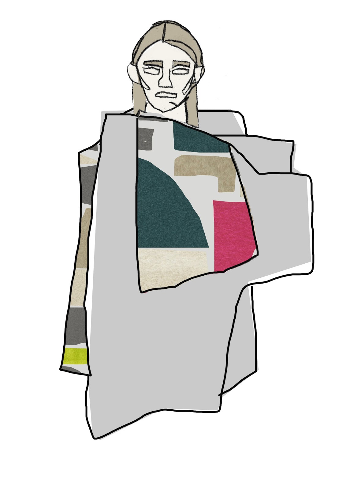
 I have been using photoshop to quickly see the design on the body by just creating a negative stencil, so that the design comes through from underneath- this helps me consider scale and how the design works as a garment.  I need to thin further about the context and whether it will go and who would where it... what is my audience or "muse" who would wear it? I have also been hand drawing outfits, using a layout pad and a body template to help create shapes that fit on to the body. Using my negative space drawings has helped me connect the shapes together to build up a garment to then apply my drawings into.


Masking off and screen printing

December 12, 2016

Today, I masked off areas of the large scale prints using masking tape and newsprint. This would mean that the background of the drawings would then gain colour, complimenting the bold design on top. I aimed to skew the screen slightly, so that the print was off centre and didn't line up so that this made an interesting design.

I found that this was fairly difficult due to the large screens I had to use,  it initially went wrong after using a squeegee that was not washed properly, meaning I had a pink line down my drawing. I tried again on another drawing, this still didn't go to plan as I found that the paper was to thin meaning that the water content made the paper curl and crease.

I used thicker paper and also use pigment, this seemed to work more successfully but I still found that this didn't work as I hoped.