BA3b

Fax paper drawing

April 30, 2017

After my tutorial with Nick I thought I would speak to Neil about fax paper drawing as I have been told he has done this previously. He gave me some fax paper and I have started drawing on it with a soldering iron, heated nails/screws and an iron. I thought that If I could heat up a variety of shapes I could build up a design on the thermal paper- I tried this with some left over wooden shapes (as they get super hot in the heat press and stay hot for a while) but this was unsuccessful. For the fax paper to react, it has to be ridiculously hot and the shapes were just not hot enough. I could possibly create some sort of resist or heat up other objects to transfer onto the paper??

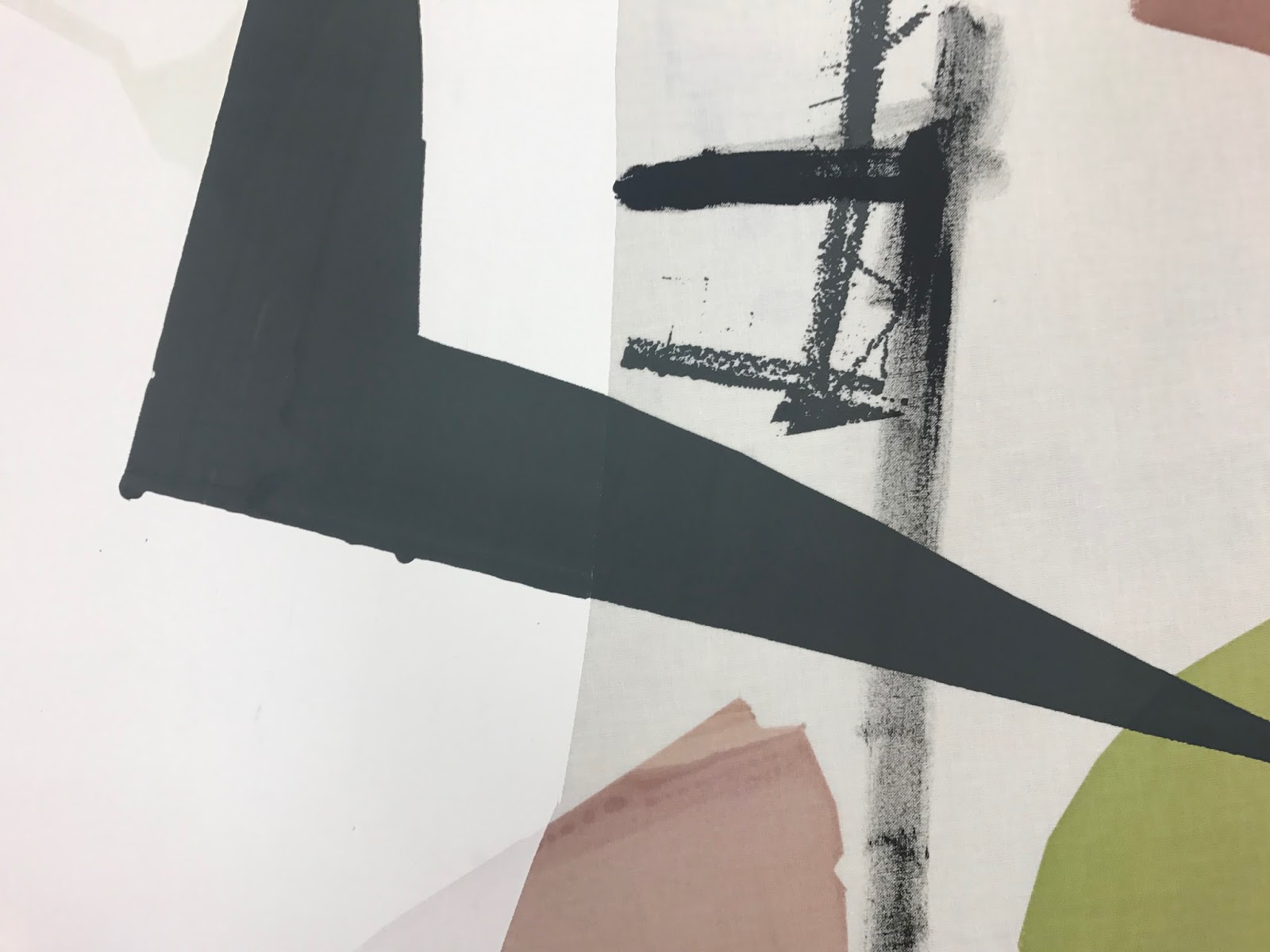
I have experimented drawing from some primary images of walls and graffiti and am really impressed with the results. The roll of paper is quite slim so they dont seem big enough to be a "drawing" but I will convert these onto screens or scan them into use in my digital drawings. I really love how the marks made are unique and are markings that you cannot get with any other technique. I like how you can combine the materials used on the paper, for example I have used thick black markers as well as pencil, coloured posca pens and oil pastels.


BA3b

Idott Wallpaper thoughts & planning

April 19, 2017

Tomorrow I will be back in the print room and need to continue to plan and figure out how I could create a repeat length for my last project and the idott competition. I want it to be based upon the cut out, simple shapes and minimal lines, using various artists and trends to influence me. In a way this is a development of my previous work from the other projects but I am finding a way to be selective in the way that I work and work to a brief.

The brief asks for a repeat wallpaper 52 by 64 cm which has to repeat in both width and height. I want to create a large scale wall covering so that the repeat can be barely seeing in length. There is an option on the brief which says that you can opt for bigger dimensions- which may be a possibility for me.

I have already began creating compositions and drawing for this project (before easter) using lining paper to help me understand the width I am working to. Tomorrow I will continue to do this and consider options for scale.

I have quickly tried repeating my cut out shapes to see how they could flow together when repeating in width and length and I think this could work.

I am going to attempt to do similar designs using paper stencils tomorrow.


I still need to sort out colours for this project, by analysing interior trends and developing colours from my photographs of urban space. 

BA3b

Easter Planning & Organising

April 16, 2017


I have been organising and sorting out my multiple projects within this body of work. I aim to name each project and every final piece/design, meaning I have a narrative for my work, which will enable me to have a disccuion surrounding it. 

Project 1  look at bradford brief>  fresh/contemporary/ cecil touchon style/ signage/graphic structured/ cut up/ reassembled- fashion


cut up
graphic
signage
urban
slices
piece
segments 

graphic divisions
urban splices
dismantled signage 


urban deconstruction


project 2  look at SDC brief> sustainable/ digital/ scribbles/ assembling/ found objects - fashion


digital scribbles
digital markings 
disjoin 
eliminate 
discard


assemble
remove

digital assemblage 


project 3  look at bastford brief> nature/ large scale/ scribbles/ loose/ subtract- interior


reassemble 
subtract 
connect 
overlay 
urban vs nature 
greenery 

reassembled space
connected greenery 
reassembled greenery 


project 4  look at idott brief> cut outs/ wallpaper/ cut and paste/ shapes/ fun/ naive/ large scale/ wallpaper/ negative space/ abstract


cut out 
cut and paste
subtract 
divide
notch 
form 
unite 
assemble
remove

cut out forms

subtract and divide 

Using the competitions as projects has helped give me a focus as I find that I easily become unfocused and struggle often with the context. Assigning my projects with a mini brief or context direction has already helped me use my time efficiently.
I registered interest for Bishops arts prize, and need to ensure I make work relevant for this brief toe> time to think about that!

Bishops arts prize, reminding my self of the brief and my register of interest >

I have realised how much my work has moved forward since then. I have worked bigger, onto fabric, using procion and a combination of industry processes. I have mentioned my passion for working on unusual materials in my register of interest for the Bishops Arts Prize. Should I work onto wood? Would this broaden my portfolio and show my skills? Or should I stick with fabric I have already been working on as I have a limited amount of time?


My register of interest:

“ I am intrigued and eager about the possibilities that surround the theme, Glimpses of Glory. I find something glorious about my surroundings, so I use it as a starting point in my textiles practice. I am attracted to weathered surfaces and signage, as well as urban grids and shapes. This forms my abstract designs and ‘cut out’ style graphic prints. I experiment with ordinary materials, inviting brilliance to the surface by applying these marks and patterns to wood, papers and plastics. This wonderful project will allow me to ponder the beauty and joy of ordinary, unnoticed, everyday wonders.  “

cut out graphic prints
wood
unnoticed every day wonders
signage 


BA3b

DYEING & PRINTING

April 07, 2017

I feel that this week as been so successful for me- finally screen printing onto cotton (fairly large) has meant that I have found even more confidence in being bold with my shapes lines and colour choices. Using the screens has enabled me to turn my small A3/A2 drawings into larger, more design like pieces.

After this week- I have reflected on the pieces I have printed and realised that I need to start printing on to a coloured background- printing just onto white has been fairly difficult and has been limiting me. Having tried printing the background with procion- I have found that it has been a longer process in the long run as I have been using pigment as resit technique. The pigment does not penetrate the fabric where procion is sat underneath- I have been using this to my advantage to create some interesting marks and contrasting colours. Laying procion down before hand as a background would mean drying, steaming, washing and drying again before taping back down on the table again. I realised that dyeing my cotton beforehand in a pale neutral using direct dyes would be a more successful and time worthy process. 

Today I tested small swatches of cotton in various combinations of pale browns/taupes/greys. I realised how difficult it is to achieve pale shades. After finally getting 3 shades that I was almost happy with I thought that I would dye some larger pieces of cotton to test on monday to see how the procion sat on top of the colour. These pieces did come out slightly darker than I had hoped- which has made me realise that I need to keep an eye on the colour as it is on the hob. 


BA3b

FINALLY PRINTING BIG

March 30, 2017

Yesterday I finally worked larger in the print room. I decided to ease in gently and work on half a metre of cotton using procion and pigment binder. I found it difficult to be loose and experimental like I was in my drawings. I felt as if i was being too controlled and tight with the way i was laying colour down and making marks. This was because of the scale- working on a white blank canvas made things difficult for me initially. I soon loosened up though and painted pigment binder on the fabric in loose marks from my drawings along side the contrasting shapes. Once I had finished I realised that there was too much white and even though this was similar too the drawings, this was emphasised because of the increase in scale. I also reasoned that i probably needed to increase the size of the shapes and marks so they are more varied in my print. I need to be more daring and less precious next time.


Today I coloured tested further as i wasn't completely happy with my chosen colours from last night. This wasn't entirely successful as i ran out of time and i ended up with a few spillages. This evening I decided to try dyeing some cotton so that the white wasn't as prominent. I aimed for a warm taupe shade and after a few testers I dyed a whole metre of fabric. This wasn't particularly successful either but I felt as if i learnt a lot from it. The colour didn't come out how I aimed- it was much paler than I hoped and there were some marks on the fabric from the bucket. Luckily this can be covered when I come to printing.

I feel like this week has been a real learning experience for me as I have been in regularly and using the print room - creating new work and reflecting on this and working out how I can improve things. Positive feedback from Nick on tuesday has encouraged and reassured me.

BA3b

Tutorial with Nick

March 28, 2017

positive
encouraging
keep going
larger
cardboard wall paper???
graphic wall paper?????
look into idott comp further! repeat specifications?


BA3b

Breakthrough with drawing!!!

March 15, 2017

After my tutorial with Nick I realised that my SDC designs/drawings were flat and this is why I wasn't keen on them. Nick advised to keep using the textures like in my previous drawings. So I  went on to create more markings using graphite, ink, posca pen and oil pastels from my imagery of graffiti, I then scanned these in and manipulated them using the invert tool and the various overlaying tools on photoshop to build up some drawings. I found that this was successful- the balance of shape and texture worked well and I managed to develop my colours too, so this seemed successful.

I began to develop these drawings into some designs using AVA, after speaking with Nick, i realised that I could repeat these just in length, so that the whole design is the width of the fabric- meaning my work would be commercially appropriate. Doing this helped me draw further in order to create relevant drawings that would flow once they are put into repeat.

Nick explained that I could work unconventionally and using felt tip markers and other drawing tools straight onto fabric to see what happened- I like the idea of this as I feel that I would become precious and wouldn't work as loosely on fabric as I am going on paper or digitally.

I aim to try and work on fabric soon and experiment with markers on fabric.


initial designs- before development


tried to briefly put into context- not particularly successful


developing drawing after speaking with Nick


putting these new drawings into repeat


BA3b

Colour decisions and designs for SDC

March 09, 2017

Today I took inspiration from WGSN trends from throughout the years to inform my decisions for colour and style. I wanted to create a classic, timeless collection for SDC as the brief mentions life span and longevity- I want to the this in different ways, not just durability of the material but longevity of the style and print and how it works in the home.

For the SDC competition I am finding it difficult to cover all areas of the brief as there is so much to consider.  I want to focus on the colour and style aspect as I want to keep my same aesthetic whilst showing I can adapt it in my portfolio.

I still plan to be inspired by my surroundings, focusing on walls and urban details. I have used this morning to draw from my previous photographs from London, using a different observing approach and focusing on the negative space and the shapes in the imagery, instead of just focusing on the textures and marks like my previous work. I still have stuck to the collage techniques with found and waste papers and materials.

I used sublimation printing to use the cut out techniques in my drawings to transfer them on to fabric using exact colours that I collated previously on photoshop. I created several designs, each different combinations of colours to help me decide what worked best in terms of colour and design.  I plan to digitally manipulate these on photoshop and AVA to create repeats or placement prints for soft furnishings in the home. I am unsure of these so far as I feel as if I have lost the texture and depth but I will still use these as colour tests and digitally manipulate them, layering markings and shadows.

I am treating this competition as an extra project, so I have gathered lots of research regarding colour, trends and sustainability as the theme is Design for a Circular Economy. I am now trying to decide what fabric to digitally print this on in order to meet the brief.


BA3b

Crits and competitions

March 06, 2017

This morning I realised that I need to create mini briefs for my self in order to work appropriately and ensure I am making the most of my time. I need to be able to create collections to apply my work to various contexts. From realising this in the crit from a comment from Les, I decided to plan the projects and how long I will take to complete them. I am frustrated that I may not be able to explore materials more (like I had planned) but I feel that focusing on print design and creating a noticeable aesthetic will be more appropriate and worthy for my future skill set and career.

I aim to research further into a variety of contexts that are edgy and appropriate to my style of work. I plan to incorporate the competitions that I aim to apply for/complete within my projects so I have more structure.
I need to further research the different contexts and how I can alter and adjust my designs and colours   to suit the applications:
-wall covering/wall paper... could I link this with the Idott competition?
-soft furnishing> bedding/homewares
-3d wall covering> wood/cardboard/3d
-fashion> urban/streetwear/activewear

After todays crit I have also realised that I must create a criteria of success in order to decide and understand whether a certain piece is working- I MUST REFER BACK TO THIS WHEN I AM STRUGGLING.

Today I considered my entries further for the Bradford competition and how I could use my work to fulfil the briefs. I want to be able to use my unique wood idea for the multi media construction entry but I am unsure where to go with that an dhow to develop if further from the coaster/ drink floor idea. I could translate these into wall tiles and have them as a design form interior but this may mean altering the print and gluing/ fusing them onto some more wood to structure it. How could this then sit on the board securely?

To improve the wood pieces and translate my current drawings, I used my textured screens to print onto them with adhesive to apply foil and create marks that contrasted the coloured shapes. I am unsure about this outcome but I will continue to ask myself questions to whether these are successful.


BA3b

Another London Visit!!!

February 24, 2017

Robert Rasushenburg
material> reusing???
colour
process
working large!!
found objects
image transfer> light fluid... research this!

tate modern

inspo from city

refreshed me!!


BA3b

Struggling

February 22, 2017

struggling with motivation etc
problems with drawing> not sure if they are working> how can i improve these? i need to anaylse them to understand what isn’t working
screen printing then cutting and piecing together
Finding hard to wrk are like Nick suggested> need t0 blow things up bigger on A3 sheets and continue to cut up
need to wrk further on my colour palette bt am enjoying the monochrome at the moment


materials development>> use materials that inspired me from the city as well as referring to WGSN list.
wood-  plywood/chipboard/mdf
cork
plastics
how can i source these and how can I apply colour to them?

BA3b

Tutorial with Nick

February 14, 2017

width of fabric is repeat????? think outside the box!!!!

gloss paint?
BIG
look at painters... COLOUR AND STYLE
mask areas off


SDC board:
explain sublimation process
most ethical synthetic fabric
treat boards like drawings
consistency on boards- text/size/colour/ placement