Visiting SADACC again has really helped me push my ideas further. It has reminded me of the processes and colours used in Indian Textiles. After doing many drawing workshops and improving my digital skills I feel like coming to SADACC again really enabled me to boost my ideas and help me combine the drawing skills and SADACC research.
Trying to balance the mountains of work piling up with everything else, like socialising and housework is beginning to become pretty difficult. I am trying to improve my work and make the most of my time here whilst trying to keep on top of the work that is being thrown at me left right and centre. I am determined to do better this year and get my work out into the world so I can start building connections, preparing me for life after my degree. Going to the Castle Museum workshop the other day has made me realise this.
I am attempting to improve my drawing by using different techniques and strategies. I was browsing the internet to gain inspiration (as always) and came across this article which was pretty helpful. Looking at sketchbook examples really helps me and makes me realise my work needs to have more direct connections with the pattern and shapes being made by the piece I am drawing from. I am going to draw today and keep referring back to the different drawing strategies and this other article that I also found very helpful. The second article is about creating excellent observational drawings, a point that made me think was, "keep outlines light". I realised I draw with outlines too much and not with shapes, shading and colour. I am going to add this to my never ending list of things to do and hopefully improve my drawing.
I found the Simple Geo Print workshop with Robert incredibly helpful last week therefore I decided to develop my skills further using the same steps but putting my own twist on them. I had to use trial and error to teach myself more skills in Illustartor but I found myself beginning to create really interesting patterns.
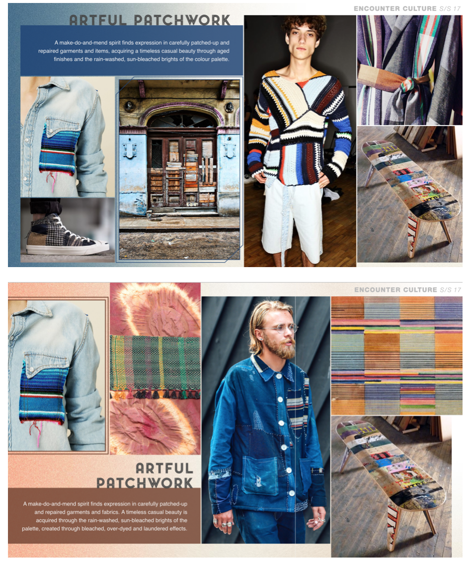
For our reports project we began researching trends for a starting point. I began looking on WGSN and saved the forecasts that caught my eye or influenced me. I really liked the 'vintage' second hand patchwork trend. It intrigued me and I had an urge to reach into the computer screen to feel the textures. I researched further into "make do and mend" looking at how it is used now and how it used be used WW2. This then encouraged me to research into secondhand/charity/vintage as these are becoming increasingly popular; even so that high street brands are copying the "vintage trend".
Make Do and Mend John Lewis pamphlet WGSN
Artful Patchwork 1 WGSN
Artful Patchwork 2 WGSN
Patched Pattern WGSN
Charity Shops During Recession
The Modern Make Do and Mend BBC News
Charity Shop Tips
Make Do and Mend IWM
Clothes Rationing IWM
Today we were informed on the importance of research which made me think I must do this more to help me with Project 2. Visits to archives, museums and exhibitions are so important as we learnt in first year so I am planning a visit to London in the next 2 weeks to visit the V&A Fabric of India Exhibition.
We were also informed about the resources online so I have spent some time exploring WGSN, Athens and the NUA library, searching through trend reports, ebooks and e-journals.
I found a very suited e-resource by Rosalyn Crosthwaite (below) which I have found incredibly useful towards my work linked with SADACC and indian textiles. She explores the use of traditional indian textile techniques as well as the changes made and influences from digital processes.
![]() |
| Crosthwaite, R. (2014) Preserving traditional Indian textile techniques from the effects of large-scale 21st century manufacturing [Online resource]. |
I signed up to an external workshop at the Norwich Castle Museum, Build your own: Tools for sharing. This was based on the special exhibition they have currently from the 3rd of October to 3rd of January. This workshop was for creative people to extend their employability skills and other creative skills and tools.
We had lectures/workshops from 3 makers; Pete Mosley, Rita Parniczky, Seb Butcher.
Personally I found Pete Mosley's the most helpful as he spoke a lot about building your own creative business in the future. He gave so many tips and smalls steps I can start making towards life after my degree. I am determined to make the most of the resources I have now at university and explore other resources like social media and e-books. I now understand how to advertise my self and connect with people. I intend to buy Pete's book, The Art of Shouting Quietly, where he explains how creative people are shy and introvert but must get their self known to be successful. To find out what your market prefers etc Pete suggested to use blogger and track popularity and see what the audience prefers. I feel like Pete touched on things that were close to home with me and I found myself agreeing to things he said and inspired by tips he mentioned.
I spoke to Pete one to one where we discussed my hometown, Northamptonshire. He visits there for workshops and I was unaware that there were any resources to explore.
Places to consider for inspiration and workshops:
-Corby Cube
-Art trails Northants
-Portfolio innovation centre at Northampton university
-Fermyn Woods
I also spoke to Rita Parniczky who is a textile artist who creates woven hangings with translucent yarn. She gave me lots of tips to stay motivated and go to London exhibitions and shops to gain inspiration. She advised me to experiment now I can as I won't always have the chance after my degree. She told us to look at other artists and their CVs to see what they did after their degree to become influenced by them. I realised that I should not miss out on opportunities and I should gain knowledge when I can to become certain on what I like and don't like! I must gain experience when I can and do not limit myself to textile design, look into architecture, fine art, psychology etc. Take risks and interview my self to find out things you didn't know before.
Because London is quite expensive to travel to I want to make the most of the resources here in Norwich and in my home town, Northamptonshire to gain the best experiences possible.
Today my group printed our repeat pattern. We set up the stoppers, t-bars and repeat distance which was faster and easier than I anticipated. I feel like I have learnt a lot about time management and working under pressure today as well as learning about the basics of repeat screen printing.
![]() |
| Group 3 metre repeat print. |

I was still unsure on my colours because I had tested them out last night and was unhappy with the way they over layed each other. I had an idea of changing the layers about, I started thinking about the colours too much and was adamant the bee on our design should be yellow. I decided to change around the colours of the layers and I found that it worked quite well. Instead of sticking to the same kind of colours (for example keeping a yellow tone on the original yellow screen with the bees and flowers) I completely changed my way of thinking to make a more investing abstract print. I really love the way this has turned out and I would love to experiment more. Unfortunately there was limited time and we could only have our large group screens for the one day but the kodatraces will be kept so I can use them to create another screen to try out and experiment with unique colour combinations. I recognised that the colours of mine and my peers prints really changed the way the print looked. Prints with bolder colours really stood out to me and were much more striking.
Whilst mixing up my dyes for my individual colour way our 3 metre group print came out of the steamer and was ready to wash. Unfortunately the yellow on our print had speckled because the dye had not dissolved properly, we did try to overcome this by blending up the dye to break down the particles, we tested the dye. unfortunately is was only when the fabric was steamed, the speckles formed. This is an issue that probably could have been resolved by boiling the dye up too. Luckily, I found this out just before i printed my own colour way (which was using a similar yellow) I boiled up the dye on the hop and then blitzed it up with he had blended just to make sure!
![]() |
| My own colour way |
![]() |
| Trying to prevent speckling in the yellow dye by dissolving the powder up by boiling and blending. |
If I could do this again I would have filled the print up more so there were less spaces, using block colours as backgrounds behind drawings and using more abstract mark making drawing. Being part of a group meant that everyone had to input their ideas which meant not everyone's ideas were listed to entirely. Group work has taught me many things and I feel more confident and happy to be part of a team again.
Quick visual research using pinterest and WGSN in preparation of our session with Robert
![]() |
| Textiles Première Vision Designs S/S 16 – Print & Pattern 02.19.15 ... Première Vision Designs S/S 16 – Print & Pattern Retro Geos S/S 16 Textiles By Product Category ... are revived with retro geometric patterns inspired by 1960s and 1970s fashion prints. Tricolour geos ... |
http://www.moma.org/collection/artists/96?locale=en
http://www.wgsn.com/content/board_viewer/#/138030/page/1
Colour testing for my individual colour way was difficult this evening and I could not get the colours correct. The print room was packed and very busy we had to queue up to weigh and mix our dyes.
Because I was using our test screen there was block colour in some layers for the fill of the flowers, this meant that colours would overlap. For my personal colours this would not work. I was trying to test out the right yellow which would not be too similar to the salmon shade and compliment the other colours too. If it was too dark the salmon colour would not show up over the top and I found that it made a 'muddy' colour. I found creating consistent colours hard because the scales are inaccurate when weighing such small amounts of dye.
![]() |
| Colour testing, particularly yellow shades, trying antique gold, acid yellow and lemon yellow and mixing them together. |
I recognised that many of the samples from SADACC had been dyed using natural dyes, this is one of my main interests overall in textiles and I thought I could incorporate this in my work for Project 2. My knowledge on natural dye isn't brilliant so doing some research will really help me in achieving naturally dyed fabrics.
The Chemistry behind Natural Dyes: https://www.youtube.com/watch?v=Gwk1B66dvAM
Natural dyes and dyeing from woodland plants: https://www.youtube.com/watch?v=qUS1uPn3vao
Natural dyes basics: http://www.pburch.net/dyeing/naturaldyes.shtml
Natural Dyeing: http://www.diynatural.com/natural-fabric-dyes/
I want to further research if it is possible to print with natural dyes using a screen.
-is there a way of adding a paste to the dye to thicken?- UPDATE http://krex.k-state.edu/dspace/handle/2097/3899- Thickening madder???
-how does it apply if so?
-will the colour stay?
-how much hassle involved?
-is it more time consuming?
Substantive dyes are used by combining the dyestuff, normally the amount equal to or twice the amount of the weight of the fibre. Then it must be strained then simmered for a while. For example turmeric (working on cotton as well as wool), onion skins, walnut husks, and tea.
Most natural dyeing is done with the use of mordants, most commonly heavy metal ions, but sometimes tannins. Tannins are important in dyeing cotton and other cellulose fibres. The mordant allows many natural dyes which would just wash. A mordant remains in the fibre permanently, holding in the dye. Each different metal (used as a mordant) produces a different range of colors for each dye.
![]() |
| https://www.pinterest.com/offsite/?token=448-526&url=http%3A%2F%2Fwww.motherearthliving.com%2Fin-the-garden%2Fgarden-ideas-grow-herbs-for-natural-dyes.aspx&pin=128282289357907277 |
Digital printer:
Uses procion and acid dyes
Prints with dyes, steamed as washed as normal (intensifies colours)
A good quality image is needed on memory stick ready to print
Can only print with Neil on Tues/Weds/Thurs
Print has to cover width of fabric
Maximum 10 days turnover (at busiest
Can use photoshop/illustrator but AVA is best
AVA is a textile repeat software
Layers must be flattened and it must be saved as a TIF file
1 metre of printing takes 45 minutes and price varies on different fabrics
Possibilities:
Print on devore fabric
Linen creates a faded, aged look
Organza can be printed on
Print some intricate parts using digital but leave spaces blank to go in and hand print
Spray on water before steamed and set, add discharge paste?
Sublimation Printer:
Uses disperse dyes
Synthetic fibres
Print from any file, print onto 60 cm wide fabric and the heat press
£13= 1 metre
I found a great book after searching in the library for books with pattern ideas etc in. The Experimental Pattern Sourcebook has great patterns from so many different artists that I have never come across before. This has given me a starting point for project 2 as it has given me some visual stimulus as well as given me artists to research further. I am fond of the fact that the artists are from different places around the world as this creates a diverse collection of artists for me to research which all have different styles and ideas.
Experimental pattern sourcebook : 300 inspired designs from around the world. Herald, J. (2010) Experimental pattern sourcebook : 300 inspired designs from around the world. Beverly, Mass.: Rockport Publishers.
Banjar Embroidery
Eastern Sind- Saami (patchwork cotton quilt page 117)
Follow Amelia's board BANJARA EMBROIDERY on Pinterest. Follow Amelia's board DESIGN FOR INTERIORS PROJECT on Pinterest.
Our group decided to trial out our print using our colours. We created a mini kodatrace collection for the 4 different colours. We found out different problems that occurred and were glad that we tested it out before the final 3 metre print on the 20th. We found that the colours work quite well, although they do not overlay to make a new colour (like yellow and blue would overlay and make a green) but not much overlaps anyway. They do not make muddy colours anyhow. We discovered that the flowers had a lot of fine detail which meant that the detail was lost when the dye was applied, the dye also bled a lot. This could have been down to the amount of pulls we did with the squeegee but we have adjusted our print design just in case. We changed the amount of lines we have in the flowers as the lines just merged into one 'splodge' of colour and the yellow block colour underneath was not visible. The line detail will be finer and more considered.
After an acid dye technical refresher with Yasmin in the print room our group had a space on the print table. This was to test out the colours we had agreed on and give ourself a chance and time to change or tweak the colours just in case they did not compliment or overlap pleasantly.
Our group on agreed on a light grey as mainly a background colour, a light yellow, a pop of orange and a dark blue/navy to act as an outline colour. All of these colours compliment each other nicely but we were unsure how they would look together, overlapped and in a design. Today we tested different tones and mixed multiple dyes up so get it just right. We are creating a mini screen using a portion of our design to put on 4 kodatraces to test what it will really look like. This is incase there are any unexpected issues or problems. We have booked the print room for Tuesday the 6th.
For colour inspiration for my group's colour way and my own, I have been using pinterest (below)
Follow Amelia's board COLOUR SCHEME on Pinterest.
In our group, we are drawing individually so we can combine our drawings together, we will temporarily stick drawings down so we can create a mock design and change compositions. As a group, we have decided that we will draw from objects that have interested us over the last few days that link to a loose theme of nature.
- Lauren: jewellery, flowers,
- Amber: bees, honeycomb/nests and leaf printing
- Me: dreamcatcher feathers, shells
- Shiv: cactus texture, shells
We think the contrast between Lauren's geometric flowers and my marks from feathers and shells will look considered and interesting.
Using a combination of drawing strategies is really helping me create different marks. Drawing isn't my strongest skill but I find that working large and loose helps me with considering shape, line and texture. Observational drawing has worked extremely well for me as I feel the pen does the work for me whilst I look at the object in detail (I need to use this technic throughout the year!).
TO DO:
Scan/photocopy/enlarge real honeycomb/bees nest and transfer that to tracing paper or kodatrace
Create a mini mock up of repeat design tomorrow (combining everyone's drawings)
Look into colour palettes as a group
We were reminded as a group on how we can creatively apply line and shape to kodatrace in a quick 1 hour session. This helped me and reminded me how it doesn't just have to be black fine liner or chinagraph pencils.
- Photo opaque (variety of brushes and mark making tools)
- Black paper
- Posca pens
- Oil pastel (rubbings/resists)
- Graphite (rubbings)
- Stitch with black thread
- Lace/fabrics
- Chinagraph
- Acrylic paint
- Hole punched paper
We began this workshop with drawing activities using our personal objects to draw from on A1 paper, using many drawing strategies:
Negative space
Texture
Line/shape
Tone/shadow
Blind drawing
Continuous line timed drawing
Using a variety of drawing strategies is really helping me find a style and forcing me to use different scales and unique techniques. I enjoy timed drawings to then subsequently add and work into them to create more considered, delicate marks. I want to build a sketch book using these techniques, layering different drawing techniques with tracing paper, acetate and contrasting textures.
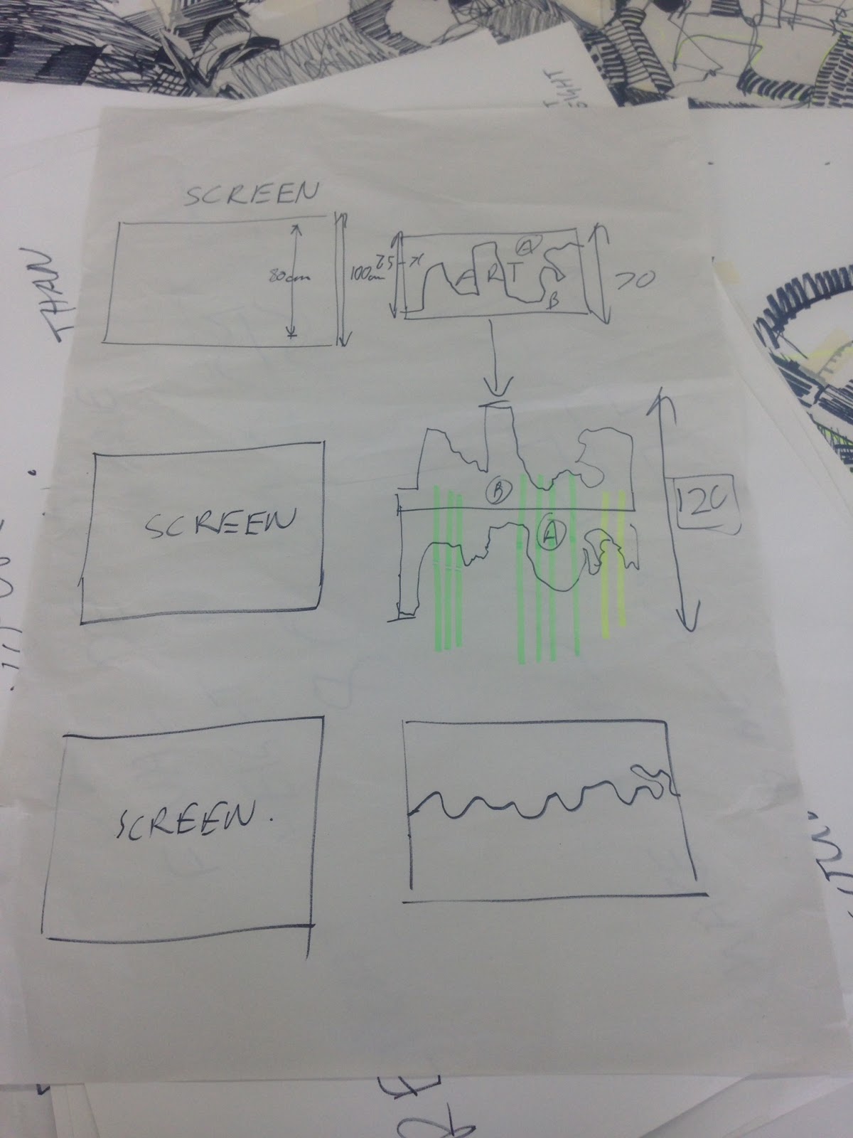
Today we combined the groups drawings we did individually with bold black pen using different strategies to create a large A1 collage of line and shapes etc, filling in spaces with and marks from our objects to ensure it flowed. We then cut through the A1 collage in a wave. Ensuring the wave was not too dramatic or high to create the subtlest repeat as possible.
Make a Repeat Pattern in 60 SecondsMake a Repeat Pattern in 60 Seconds with Julia RothmanFull Class → http://skl.sh/repeat-patterns
Posted by Skillshare on Friday, 16 October 2015
Today I started 2nd year Textiles and began drawing straight away. We were briefed on Ba2a and then started a drawing shop that informed us on repeat printing.
Using different drawing strategies like continuous line and timed drawing we observationally made drawings from decorative and vintage objects.
We had rules put in place:
-Black thick pen
-A1 paper
-Hold the pen with like a paint brush (loosely)
-Stand up and don't bend over the table when drawing
-Continuous line
Having had a very busy summer I feel as if I have neglected drawing. I have spent my day researching ideas and themes for BA4 as well as looking at the last years BA4 brief to give me an insight. I have a collection of shells from my summer breaks so I chose to use these to observationally draw from them as I know this is the best way. Using simply chinagraph wax pencils and 0.1mm fine liner I have studied the textures as well as the lines and marks of various shells.
I also used photographs from London Zoo to "warm me up" and begin my drawings.
Visiting New York City in May was a trip mainly organised so that textile design students at NUA could visit Surtex. Surtex was a show full of (mainly) textile prints . I liked how the prints were shown in context on some of the stands. We had the opportunity to talk to the exhibitors which enlightened us with the work involved and expected of us. The show was huge, I noticed I started looking at the stands that really stood out and caught my eye after a while. I became aware of the similarity between many stands which proved to me that my work must be unique to stand out and gain attention.
We also visited the National Stationery Show and The Furniture Fair which were in the same building. I personally enjoyed browsing the stationery show the most as there was a larger variety of prints, illustrations and patterns. Visiting The National Stationery Show enlightened me and introduced me into the broad range of different styles and opportunities in the stationery industry. I was inspired by the fonts an graphics used and this has encouraged me to practice my photoshop skills. This will enable me to create photoshop designs from my drawings, which I have previously done in my first year of Textile Design at NUA.